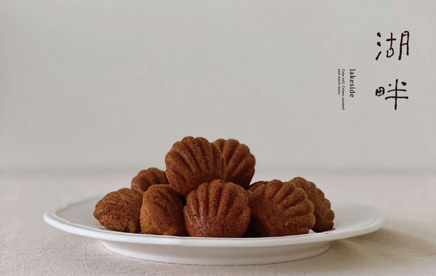
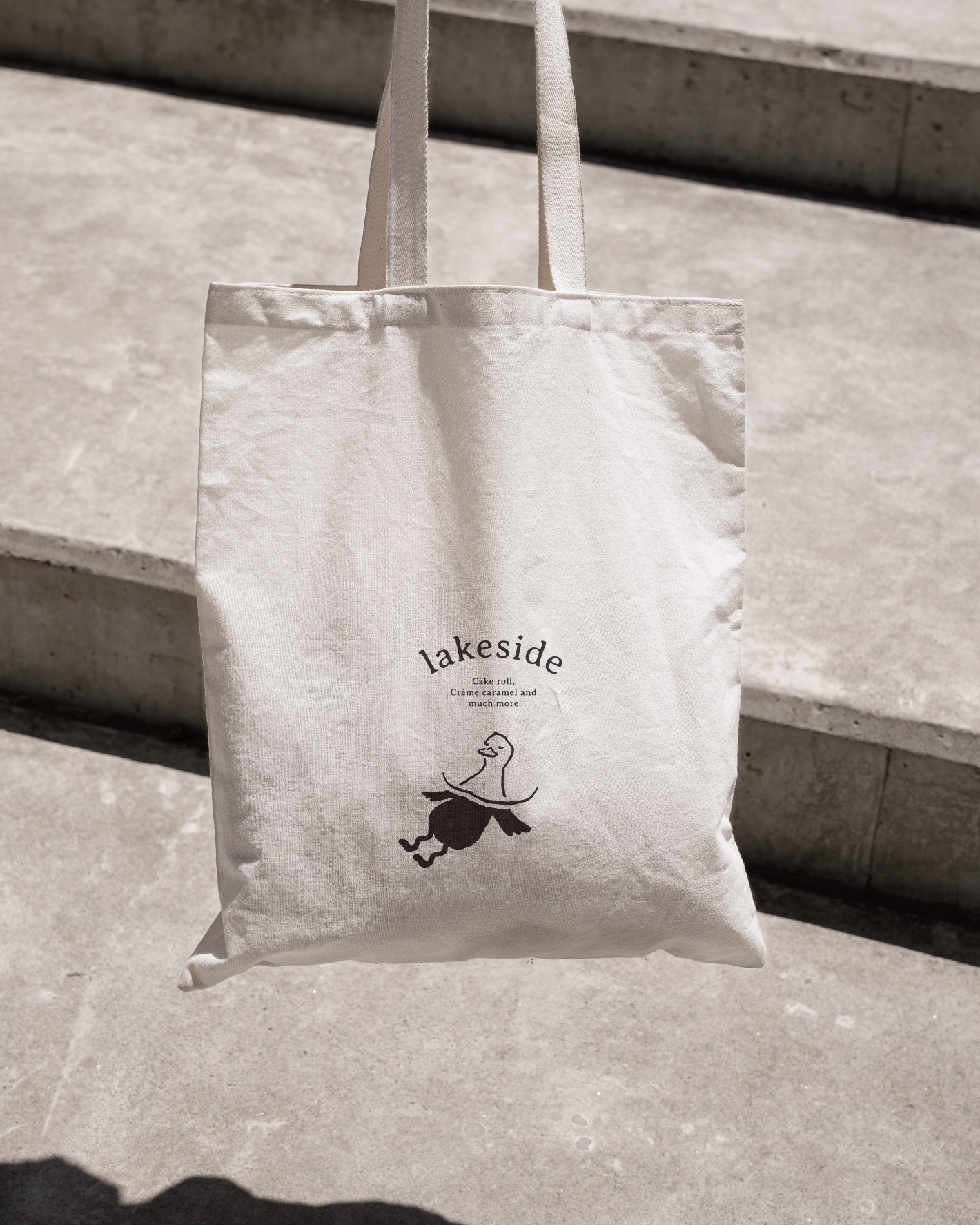
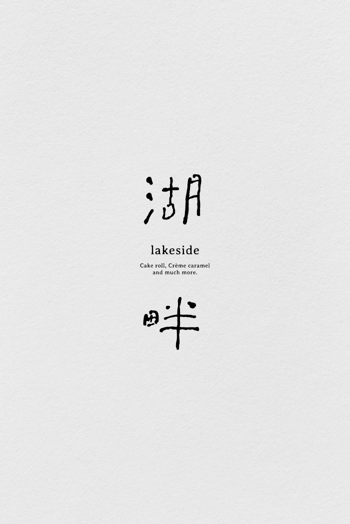
湖畔 lakeside Branding
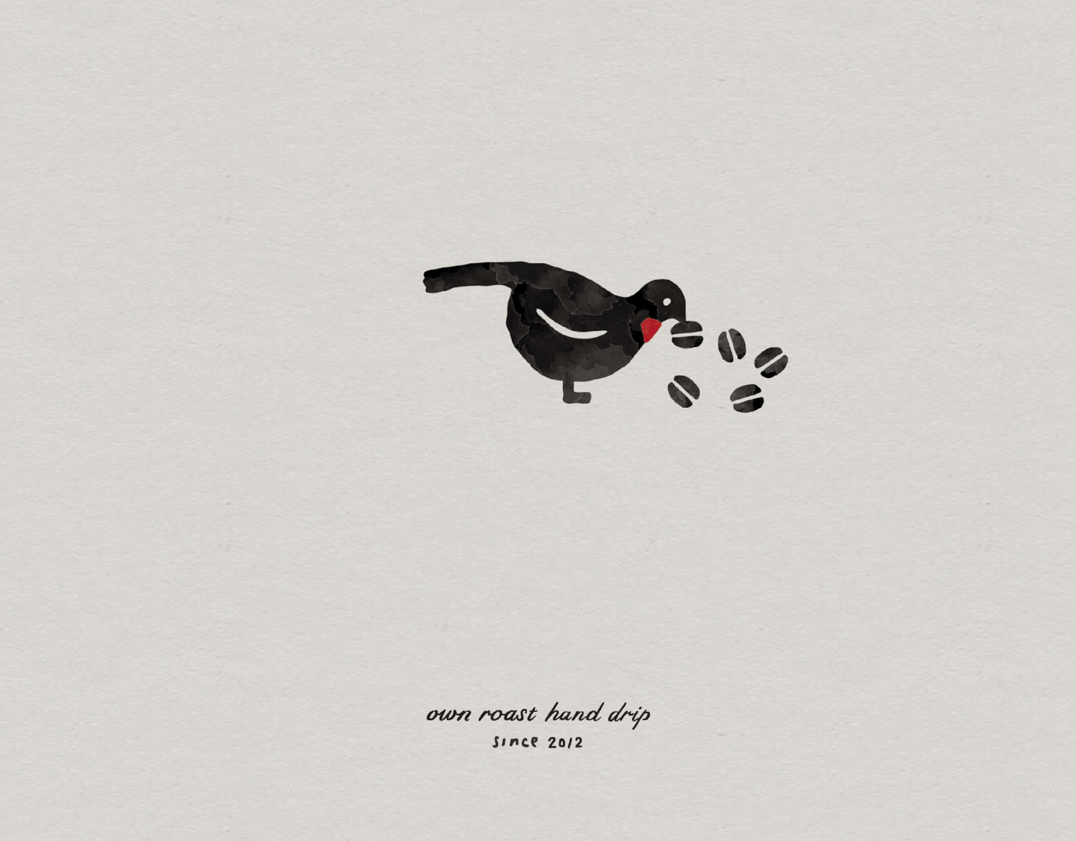
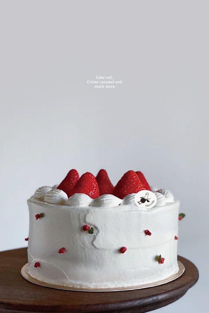
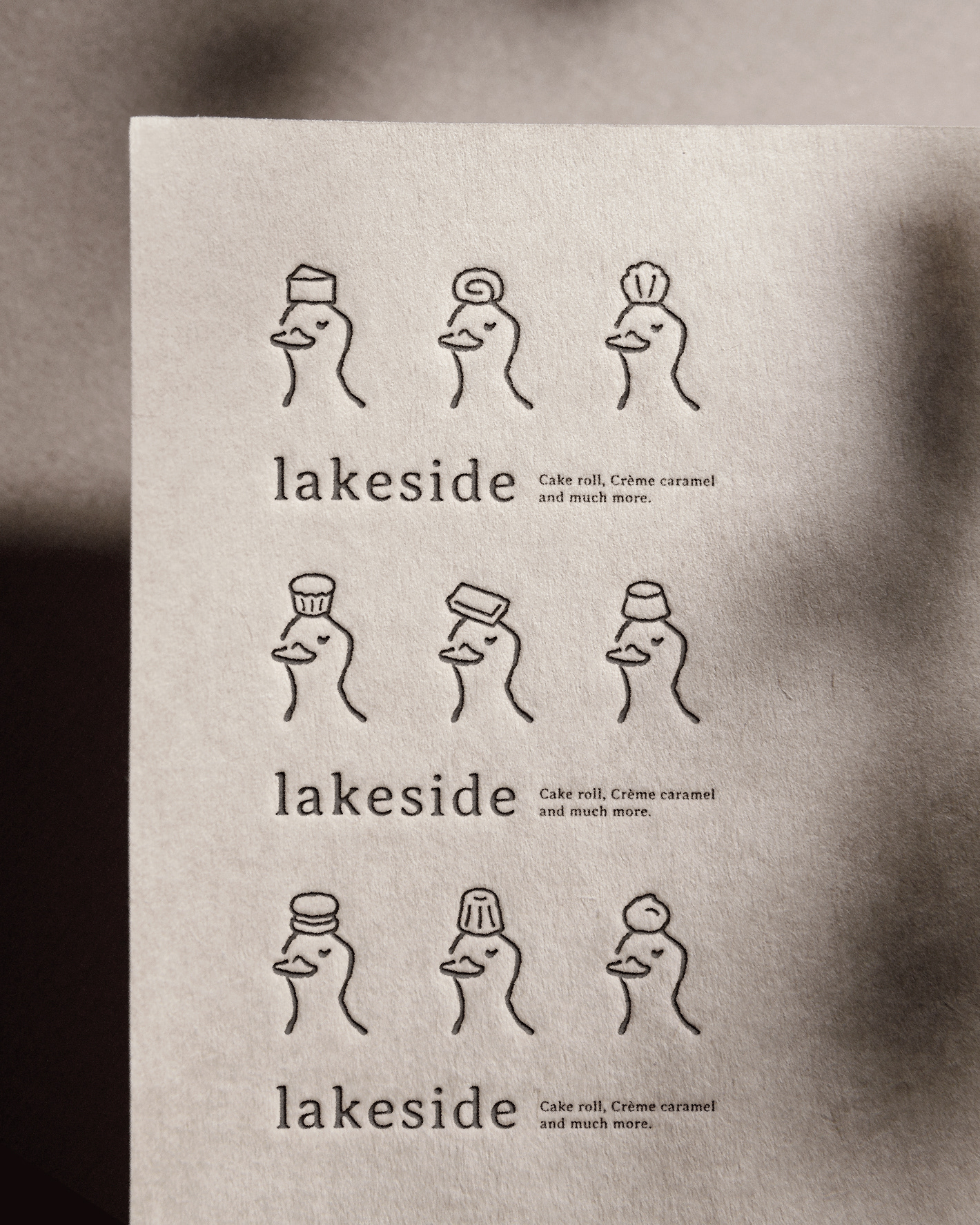
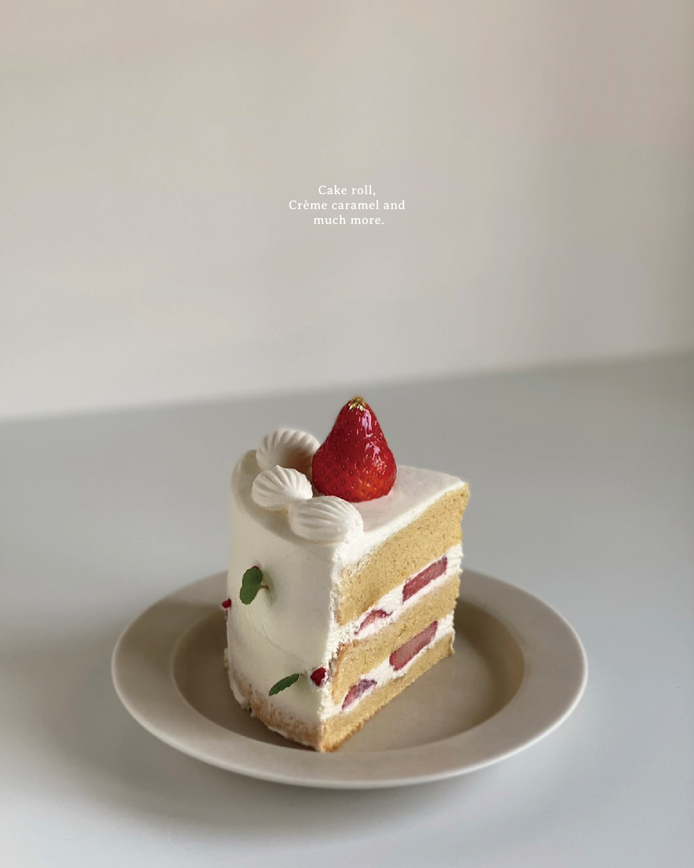
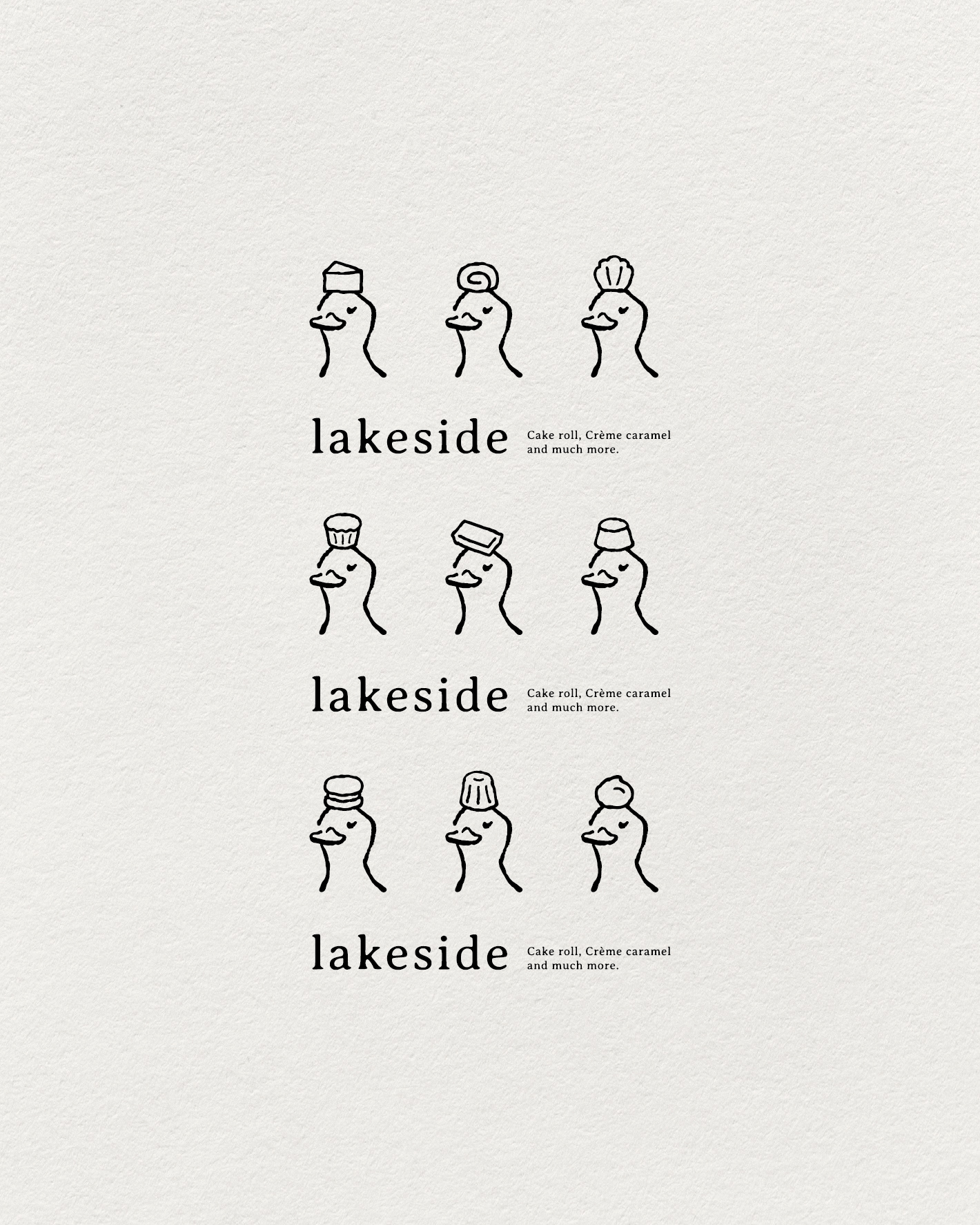
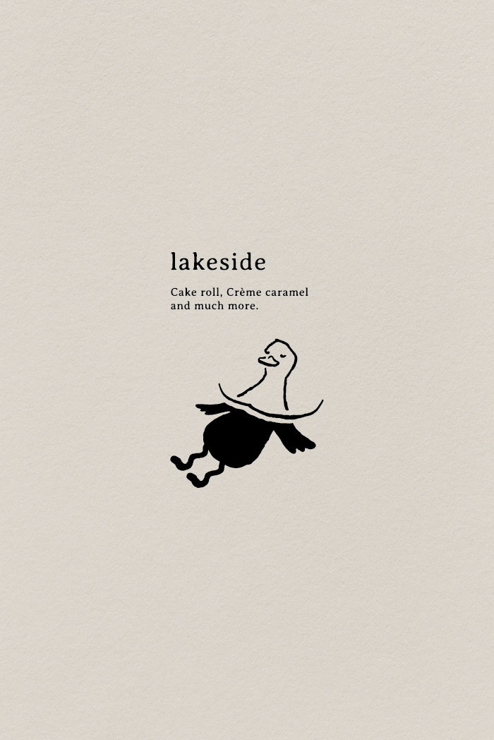
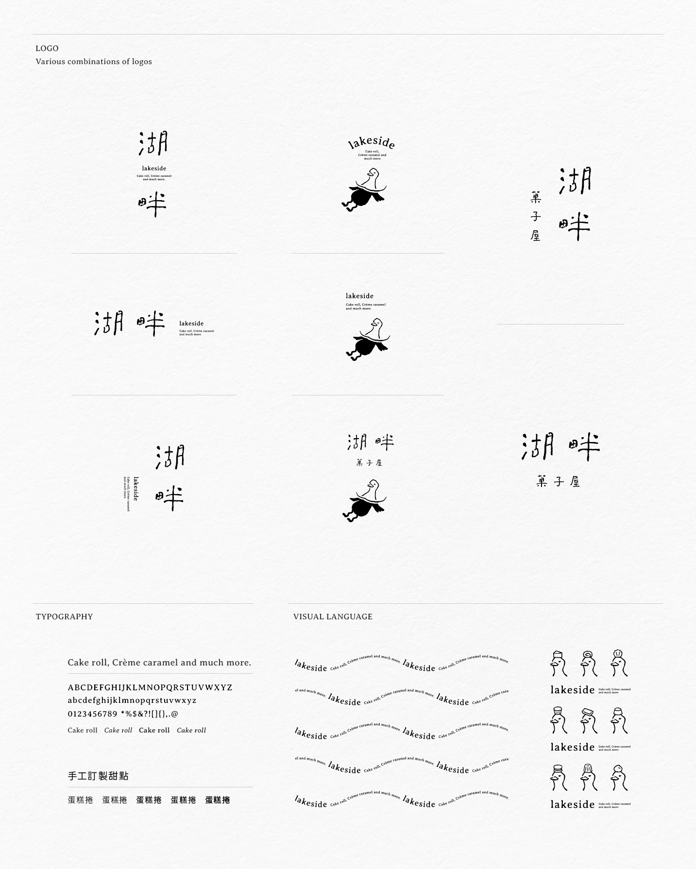
湖畔品牌名起源於主理人在荷蘭生活時經常帶著自己做的甜點去湖畔野餐,放眼望去是悠閒的鴨子們與閃爍的波光。品牌標準字以水波感的手寫字傳達輕鬆自在的湖畔野餐的氛圍,品牌標誌則呈現鴨子泡在湖水中悠遊自在的樣子。在延伸的品牌圖紋中,鴨子頭頂著代表品牌的9種甜點「戚風蛋糕、生乳捲、瑪德蓮、瑪芬蛋糕、費南雪 、布丁、達克瓦茲、可麗露、泡芙」,可依照訂製甜點、市集擺攤...等,不同使用時機時靈活搭配使用。
The name of the lakeside brand originated from the fact that when the owner was living in the Netherlands, she often took her homemade desserts to the lakeside for picnics. What she saw was the leisurely ducks and twinkling waves. The logotype standard characters are handwritten with a wave-like feel to convey the atmosphere of a relaxing lakeside picnic, and logomark depicts a duck swimming leisurely in the lake. In the extended brand pattern, the duck's head holds nine types of desserts that represent the brand “ Chiffon cake. Cake roll, Madeleine, Cupcake, Financier, Pudding, Dacquoise, Canelé & Puffs ”, it can be customized for desserts, market stalls, etc., and can be used flexibly for different usage opportunities.


Extra Info.
Client|@le_lake_side
Project|湖畔 lakeside Branding
Brand Identity|Neu
Photo|@le_lake_side
Release date|Nov. 2023
Project|湖畔 lakeside Branding
Brand Identity|Neu
Photo|@le_lake_side
Release date|Nov. 2023